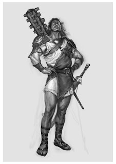
God of War is probably the closest thing to the kind of game I'd be interested in doing art for - a game based on ancient Greek mythology. In my case, I'd like to work on a game based on Viking/Norse mythology. It'd be awesome to experiment with the Gods!
God of war has some absolutely amazing character designs - especially in terms of Greek deities.
I like how a lot of the character creations have been done in black and white - this gives you a good idea of things such as light, shadows, value etc.
Some of these paintings are incredibly detailed.

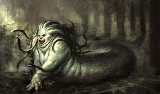
Playing around with something that is mythological really allows you to manipulate humanoid forms and make them a little crazy. It is always interesting to see different people's takes on characters like Zeus and Medusa, who have existed for centuries.

I like how in this image you can see a full-body character design to get the overall feel of the character and then there are more designs of other details around it - in this case, character heads. It gives the viewer a quick look at how different characters can be made very quickly, without having to redraw the entire character over and over.
This is a colour painting of the main character in the game. You can really see what difference colour makes here to these images.
Of course, things like armour look a lot better in colour - helps you to distinguish between different kinds of materials.
These kinds of digital paintings seem like early screenshots for the game. They establish the environment/scene/characters/mood/gameplay style and much more. It is amazing to see early paintings like this actually become interactive games.
Some of the other character designs really explore colour, which is very powerful and important when creating a mood. Red is a very provocative colour that could mean a lot of different things - all which immediately give the viewer an understanding of the personality of the character. For example, red could mean anger, hell, danger, death - or it could (but most likely not in this case) mean love, passion etc.
As mentioned before, it is always interesting to see how different people see characters like Zeus, who have existed for centuries. The problem here is that there are many generally accepted conventions - e.g. white hair, white beard, robes etc. It's hard to break away from these conventions - this is a major concern of mine with my own work.

However, in other cases, such as this character design of Medusa, most conventions have been broken. It is design like this that really makes me passionate about design.

This is one of my favourite characters in the game - Gaia - the Greek personification of the Earth. This character really creates an absolutely incredible environment and also defines the scale of the game - when you see your character on Gaia, it seems like she is a whole gigantic world by herself - then you realise the world that SHE is only a small part of and - wow. Amazing.
This beautiful image also gives you some idea of what I mean by the scale of the game.

I love how so many character explorations can be so emotive, rough. This digital painting seems so much like a real life painting. One thing that I always used to think "real" painting achieved better than digital painting is the motion of the artist's arm - a very good way for the artist to release emotion onto a canvas with their movement.
This paining reminds me of this and i wonder whether the artist had the same sense of release when making this image.

 I absolutely love the colours in this image - the way that the character contrasts with the background. It is incredibly weird - she must have an amazing imagination. I absolutely love her painting style. She blends everything so well and uses textures very well too.
 I love the texture of the girl's skin in this image - like her skin is scaly or cracked. The facial expressions here are also so amazing. She is really good at creating emotion-driven narratives in her work.
 She also does absolutely amazing character designs. She has a very good knowledge of colour use.


