Tuesday, August 24, 2010

Batman - Arkham Asylum

I think that this was my favourite game of 2009. The game was more or less perfect in every way.

This image shows the process of creating the very comic-book/graphic novel art style. I love how they've kept this element in the game - it's really like they've brought the comic book world to 3D life.


The character designs have been kept quite true to the style of those in the old Batman comics/graphic novels. This black and white painting is a really good starting point when beginning to explore a character - you don't have to worry so much on colours and can therefore complete very quickly.


...and then eventually you can put in the extra effort to create beautifully detailed coloured paintings.


Again, these concept character explorations are more in the old comic-book style with very simple painting style which still works well and can still show a lot of detail.


A lot of time and attention was put into the character design of this game. Since all the characters have been designed and redesigned again and again, they all have a more or less accepted "look" and all have a very rich and important history, so a lot of care had to be taken with the designs for this game.

This is the concept art for the villain character Bane.


One of this game's strongest points would have to the the 3D character models. When comparing the models to the 2D concept art pieces, you can really see why the concept art is such an important part of the whole design process, and it is wonderful to see these sketches come to "life"

This game had the most beautiful and most detailed character models I've ever seen. There was such an attention to detail - even things like veins were included.


This is the concept art for one of my favourite characters - Harley Quinn, the Joker's sidekick.


Again one can see how artists and designers transform relatively simple 2D images into absolutely stunning 3D models.


The Joker was the main villain in the game, so his design had to be absolutely perfect.

I love the attention to detail here - the 'defining' features of the Joker have been explored very well here - the face, the hand etc.


Killer Croc's character was definitely one of the most impressive of the game.


His 3D model was by far the best too - every scale on his body was defined with amazing attention to detail.


Poison Ivy was another brilliant character


I love these concept drawings for the scarecrow character. He was definitely one of the creepiest characters in the game and I think that this was really shown in his design.



Monday, August 23, 2010

Assassin's Creed 1 & 2

Assassin's Creed 1 was one of those games that seemed to change the face of gaming. Well, maybe not really, but definitely for me. It was one of the first games that I obsessed over in the months prior to its release - I think I watched that trailer a million times. It was one of those games with such amazing visuals that I could almost believe that it was actual video footage. Unfortunately the gameplay made this game pretty terrible. The second game, which I only just started and then had to pack away at the start of semester (study + xbox = fail) has equally amazing visuals and seems to have better gameplay too.

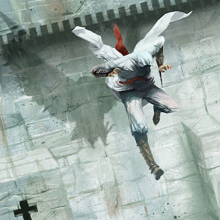
Anyways, here is some of my favourite concept art pieces:


These images are sketchy and quite rough but absolutely beautiful. I love how even something as small (although vital to the story) has so much attention and time devoted to getting it perfect.


This piece shows the main character more or less like he actually looks in the game - he is so realistic, so human.


I like the symbology in this image too - designing the character and his attire with something like shadow in mind.


The character models were so realistic and detailed - it's definitely worth taking a proper look at.


This is the completed character model.


It is also very cool to see how much effort they put into the townspeople - the people who are just intended to provide some sense of civilization and realism


Again, a lot of attention has been paid to detail when it comes to costume design. This gives you some indication about the immense amount of work that would go into making something like a game where most of these "townspeople" characters would mostly be ignored anyway.


I love this style of digital painting - everything is so rough and sketchy, but gives you a clear idea about who the character is.


One of the best parts of both games is the research that went into the environments - the first game is based in the whole Jerusalem area and its' surrounds, and the towns have been modeled as close to what they actually would have been like according to extensive research. I think that this is so ambitious and gives the game a sense of realism and support - especially considering that the game is 'loosely' based on actual historic events.


The second game has been set all over Renaissance Italy with a similar attention to historical accuracy. These artists and designers have really been able to create a convincing world for the characters.